BottomAppBar
A material design bottom app bar.
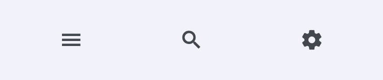
ft.BottomAppBar(
    bgcolor=ft.Colors.SURFACE_CONTAINER_LOW,
    content=ft.Row(
        alignment=ft.MainAxisAlignment.SPACE_AROUND,
        controls=[
            ft.IconButton(ft.Icons.MENU),
            ft.IconButton(ft.Icons.SEARCH),
            ft.IconButton(ft.Icons.SETTINGS),
        ],
    ),
)
Inherits: LayoutControl
Properties
bgcolor- The fill color to use for this app bar.border_radius- The border radius to apply when clipping and painting this app bar.clip_behavior- Defines how the content of this app bar should be clipped.content- The content of this bottom app bar.elevation- The z-coordinate at which to place this bottom app bar relative to its parent.notch_margin- The margin between the FloatingActionButton and this app bar's notch.padding- Empty space to inscribe inside a container decoration (background, border).shadow_color- The color of the shadow below this app bar.shape- The notch that is made for the floating action button.
Examples
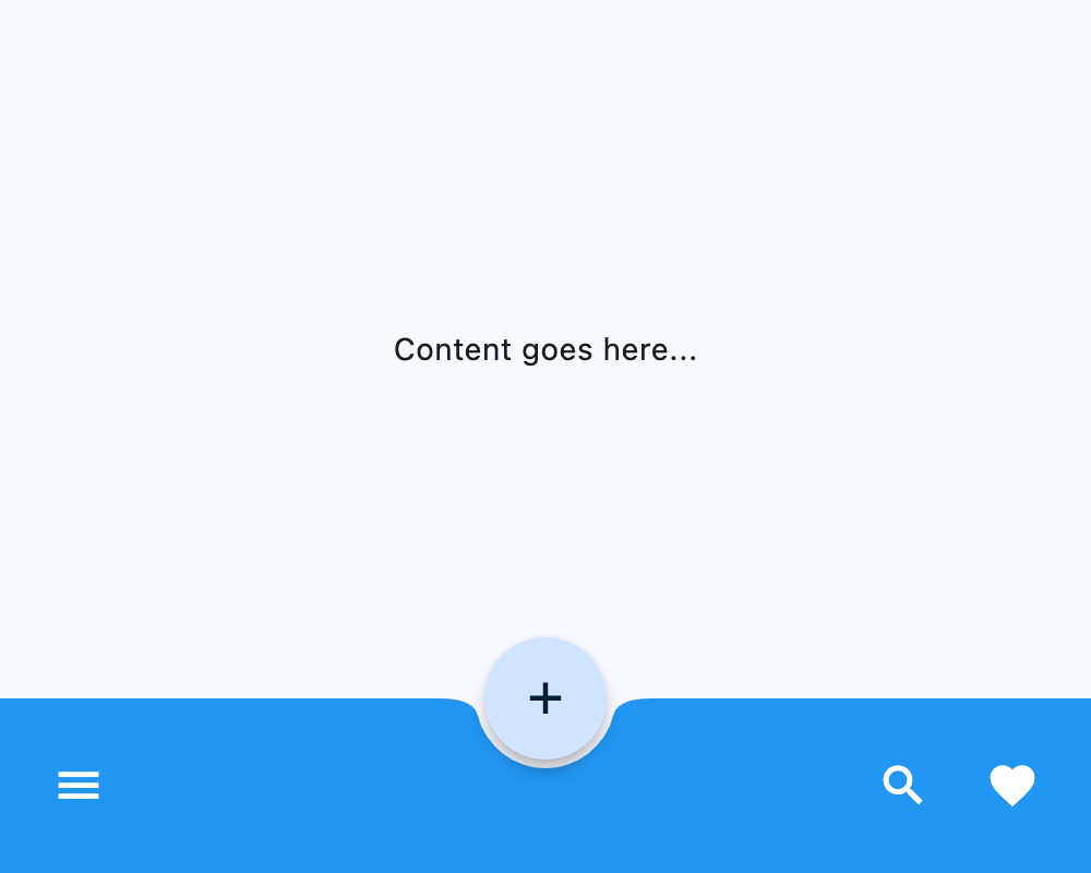
Notched FloatingActionButton
import flet as ft


def main(page: ft.Page):
    page.vertical_alignment = ft.MainAxisAlignment.CENTER
    page.horizontal_alignment = ft.CrossAxisAlignment.CENTER

    page.floating_action_button = ft.FloatingActionButton(
        icon=ft.Icons.ADD,
        shape=ft.CircleBorder(),
    )
    page.floating_action_button_location = ft.FloatingActionButtonLocation.CENTER_DOCKED

    page.bottom_appbar = ft.BottomAppBar(
        bgcolor=ft.Colors.BLUE,
        shape=ft.CircularRectangleNotchShape(),
        content=ft.Row(
            controls=[
                ft.IconButton(icon=ft.Icons.MENU, icon_color=ft.Colors.WHITE),
                ft.Container(expand=True),
                ft.IconButton(icon=ft.Icons.SEARCH, icon_color=ft.Colors.WHITE),
                ft.IconButton(icon=ft.Icons.FAVORITE, icon_color=ft.Colors.WHITE),
            ]
        ),
    )

    page.add(ft.SafeArea(content=ft.Column(controls=[ft.Text("Content goes here...")])))


if __name__ == "__main__":
    ft.run(main)
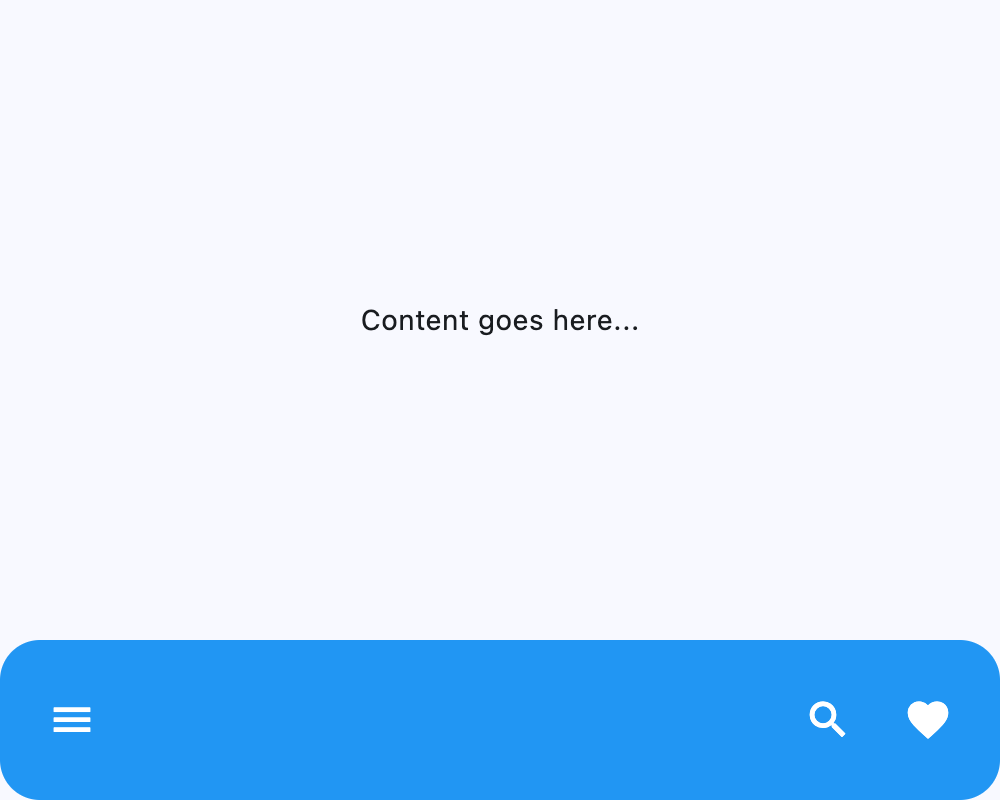
Custom border radius
import flet as ft


def main(page: ft.Page):
    page.vertical_alignment = ft.MainAxisAlignment.CENTER
    page.horizontal_alignment = ft.CrossAxisAlignment.CENTER

    page.bottom_appbar = ft.BottomAppBar(
        border_radius=ft.BorderRadius.all(20),
        bgcolor=ft.Colors.BLUE,
        content=ft.Row(
            controls=[
                ft.IconButton(icon=ft.Icons.MENU, icon_color=ft.Colors.WHITE),
                ft.Container(expand=True),
                ft.IconButton(icon=ft.Icons.SEARCH, icon_color=ft.Colors.WHITE),
                ft.IconButton(icon=ft.Icons.FAVORITE, icon_color=ft.Colors.WHITE),
            ]
        ),
    )

    page.add(ft.SafeArea(content=ft.Column(controls=[ft.Text("Content goes here...")])))


if __name__ == "__main__":
    ft.run(main)
Properties
bgcolorclass-attributeinstance-attribute
bgcolor: Optional[ColorValue] = NoneThe fill color to use for this app bar.
If None, flet.BottomAppBarTheme.bgcolor is used;
if that is also None, then defaults to flet.ColorScheme.surface.
border_radiusclass-attributeinstance-attribute
border_radius: Optional[BorderRadiusValue] = NoneThe border radius to apply when clipping and painting this app bar.
clip_behaviorclass-attributeinstance-attribute
clip_behavior: Optional[ClipBehavior] = NoneDefines how the content of this app bar should be clipped.
If None, defaults to:
- flet.ClipBehavior.ANTI_ALIAS if border_radius is set and not equal to flet.BorderRadius.all;
- Else flet.ClipBehavior.NONE.
contentclass-attributeinstance-attribute
content: Optional[Control] = NoneThe content of this bottom app bar.
elevationclass-attributeinstance-attribute
elevation: Annotated[Optional[Number], V.ge(0)] = NoneThe z-coordinate at which to place this bottom app bar relative to its parent. It controls the size of the shadow below this app bar.
If None, flet.BottomAppBarTheme.elevation is used;
if that is also None, then defaults to 3.
Raises:
- ValueError - If it is not greater than or equal to
0.
notch_marginclass-attributeinstance-attribute
notch_margin: Number = 4.0The margin between the FloatingActionButton and this app bar's notch.
Has effect only if shape is not None.
paddingclass-attributeinstance-attribute
padding: Optional[PaddingValue] = NoneEmpty space to inscribe inside a container decoration (background, border).
If None, flet.BottomAppBarTheme.padding is used;
if that is also None, then defaults to
Padding.symmetric(vertical=12.0, horizontal=16.0).
shadow_colorclass-attributeinstance-attribute
shadow_color: Optional[ColorValue] = NoneThe color of the shadow below this app bar.
If None, flet.BottomAppBarTheme.shadow_color is used;
if that is also None, then defaults to flet.Colors.TRANSPARENT.
shapeclass-attributeinstance-attribute
shape: Optional[NotchShape] = NoneThe notch that is made for the floating action button.
If None, flet.BottomAppBarTheme.shape is used;
if that is also None, then the shape will be rectangular with no notch.